The Group

We are an A2 Media group of students consisting of Jason, Berry, Becky and Hoalie.

Jason

Producer/Cameraman/Director/Main Editor.

Hoalie

Graphic Designer/Web Developer/Editor.

Berry

Costume/Props/Make-up.

Becky

Make-up/Costume/Setting.

Wednesday, 14 December 2011

Make up tests - JASON


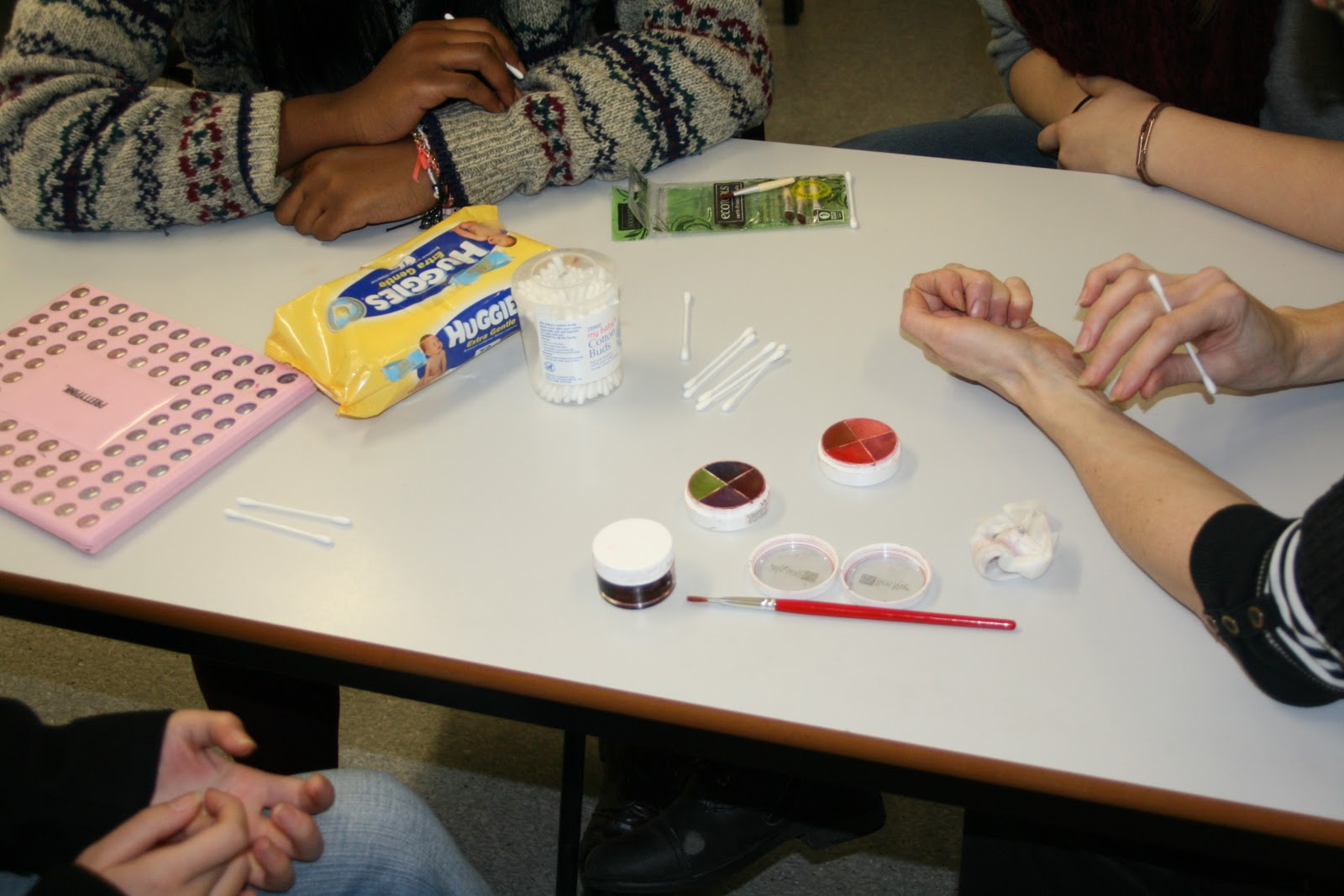
Here on this table is the make up and equipment that we will be using.
This consists of:
 Make up brushes
Eye shadow pallette
Cotton buds
Baby wipes
f/x color wheels - Ck-1Bruises, CK-9 Severe exposure
Fresh scab
Latex


Here is the first colour being applied to the wrist the best wheel to use is the ‘severe exposure’ as it is colours that resemble cuts and new wounds better. A fine brush was used to make it quite thin.
This is the first layer and will give the affect that it has been cut and make it more genuine.


On top of this layer ‘fresh scab’ was applied. This gives the idea that it is/was an open wound and makes it look much more real.

Here are the initial wounds without the final touches.

Then using cotton buds. Around the cut bruises were added lighter colours were use to make it look recent.


Then bruises were made on the arm with a similar colour to look like recent impact wounds.


. 
These are the final outcome of the cuts and bruises, as you see we wanted then to look recent which is why we have a lot of reds and fresh cuts. The idea is that she has recently been attacked before she is running through the woods.


We wanted to give the idea that the injury came from the ground in a forest so a dark coloured foundation was crushed and stuck on the bruise or graze with latex, this is so it sticks to the arm and looks real.
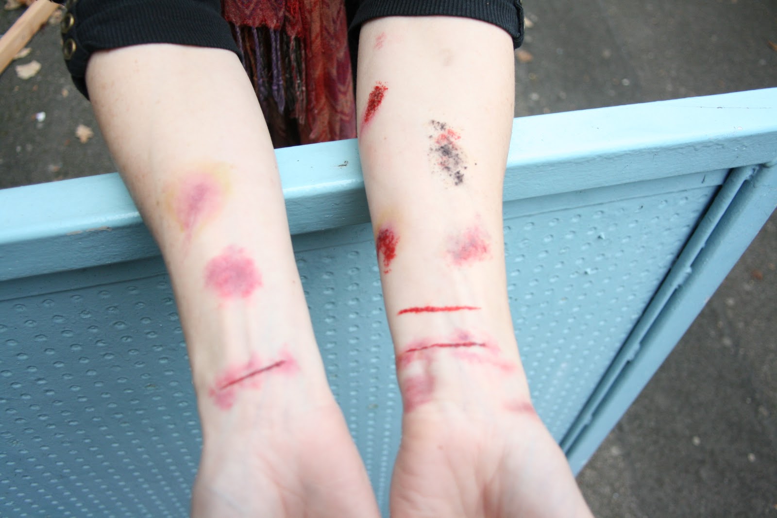


This is the final outcome of the make up test.
We went for more recent looking wounds, as in our trailer the victim is going to be recently hurt. Which are common in slashers, like if she has been cut and she is running away.


Here is us using the same technique to create a sliced neck. For extra practice and if we do think about maybe using it.

Friday, 2 December 2011

Research into Lighting - HOALIE

Lighting Types

Lighting is a very important aspect for shaping meaning in films. The lighting technicians in a film crew have the task of creating lighting to suit the mood and atmosphere of each scene in a film. The type of lighting can greatly affect the atmosphere that is trying to be created. There are several kinds of lighting situations. You could have diffuse, non-directional lighting, for example, the light on an overcast day. Another type of lighting is lighting from one direction. A common example of this is the rays from the sun. As the sun is so far away, it can be treated as a point source of light, which is what gives it such a strong directional quality.
Directional light can be split into 3 rough types. These are frontlighting, sidelighting and backlighting. As hinted by the names, frontlighting refers to light coming generally from in front of the subject, while sidelighting is when light comes from the left or right of the subject, and backlighting is where light hits the subject from behind, and goes relatively directly towards the camera. They are not fixed angles; you can have different proportions of two of these happening at the same time.

Frontlighting
This is one of the easier lighting situations to work with. When you have light coming from in front of the subject, they are lit up quite evenly, and the contrast is relatively low. This allows for decent-looking shots from lower quality cameras, where the dynamic range may not be that great. Frontlighting should be quite easy to meter for. Automatic camera modes should be able to handle this situation correctly. One disadvantage of this lighting scenario is that the subject is facing the light, which can cause squinting.

Pros:
  • Provides the most information to the camera by lighting the entire scene.
  • Easiest type of light to deal with photographically because there are fewer shadows to confuse the camera's light meter.
Cons:
  • Can be a bit boring—pictures lack volume and depth.
  • Textures and details are minimized. Scenes appear flat with few shadows.
  • Flash pictures may result in very bright subject areas and very dark backgrounds, if the background is beyond flash range.


Sidelighting
You have sidelighting if the light is coming primarily from the left or right of the subject. If the difference in illumination between the left and right sides is large, then the side in shadow may look a lot darker than how you see it in real life. This is to do with the limited dynamic range of the camera; it cannot capture details in both the bright and dark areas if the difference in brightness is too large. However, the effect you get is a dramatic looking picture.

Pros:
  • Can separate the subject from the background.
  • Conveys depth, as in a landscape at sunset.
  • Conveys texture, as in a weathered tree, fence, or plowed field.
Cons:
  • May be too severe for some subjects, creating some areas that are too bright, and some that are too dark. (See Fill flash to compensate.)


Backlighting
This lighting type is one of the most challenging ones to capture correctly, but is potentially the most beautiful. When you have light coming from behind the subject, you have a very large difference between the brightness levels of the subject and background. If you don't reduce this contrast by adding in light from the front, you'll lose detail in one of them.

Losing detail in the subject will result in a silhouette picture, where the subject becomes a block of dark solid colour. Sacrificing detail in the background is done by overexposing it too keep the subject at a good exposure. This can introduce effects like lens flare and light bleed, which can add to the image if you're trying to convey a warm atmosphere.

Pros:
  • Simplifies a complicated scene by emphasizing the subject, as in a silhouette.
  • Provides a flattering halo of light in portraits.
  • Adds strong shadows in landscapes.
Cons:
  • Lack of detail in a dark subject.
  • Causes lens flare resulting in low contrast and strange light spots across the picture.
  • Using exposure compensation to overcome backlighting results in too-bright background.

Thursday, 1 December 2011

Tester trailer - JASON


Klown tester trailer


This is a video that Jason created with his friends out of college. This was what the final trailer is intended look like but of course to a much more professional standard as this was just a practice shot.Doing this practice shot enabled us to see if our idea really worked as we only talked about it in theory. This allows us to think what is the best angles to work with and what is needed to make our trailer perfect.

Youtube page - JASON


Here is our youtube page to post any videos we do including our main teaser.
Youtube is a very revolutionary website that has helped people post videos to the world.

Wednesday, 30 November 2011

Mood Boards - HOALIE

WEAPONS
This is the mood board I have created for the possible weapons for the clown could use in the trailer.


Every killer in a horror movie will have a notorious weapon which is memorable to the audience and will be associated with him. Here are the possible weapons we could use for the trailer, it involves a grungy and rusty metal tool that is very frightening. We wanted to use an everyday tool so that it looks more realistic and have a possibility of it happening in real life so it gives the audience a more frightening experience.

VICTIM
This is a mood board I have created for the victim of what she will wear and how she is represented in our film trailer.
Here are a few samples of what we imagine our victim to look like and wear. As a common convention of horror films, the main girl is usually the one who doesn't drink, take drugs or have sex, the characters that actually do these things are the one that gets killed my the killer first. The main girl is the one that survives until the end who escapes from the killer or kills him, but the killer always mysteriously survives. 

The main girl is usually a white female in horror films. So we have also decided to use a white teenage female for our teaser trailer. We want to make her look like a normal teenage girl so we are going to have her wear causal clothes such as plain jeans and a plain top/vest.


KLOWNS
This is a mood board I have created for the ideas we have of what the clown could look like in our film trailer.

Here is a mood board of the various type of clown styles we could use for our clown. After looking at them, we have decided to use make-up for our clown as it gives off a scarier feeling. Using a mask is too typical for horror films, film such as Halloween, Nightmare on Elm Street, Scream and Friday the 13th all use masks for the killer. We feel that by using make-up for our clown it would make our killer different from the others and the fact that there isn't much clowns used as a killer in horror films, ours will stand out. 

Tuesday, 29 November 2011

Film Title Response - HOALIE

I have asked a sample of people to read the film treatment and look at the 14 different fonts I have chosen then choose the font that they thought would suit the film title the best.


Above are screenshots of the conversation i had with 4 people. 1 had chosen number 3, 1 had chosen number 11 and 2 had chosen number 13. The people who chose number 13 thought that it fitted well with the theme of the film storyline.

Film Title - HOALIE

I have done some research into different fonts already used for horror films and it gave me inspiration for designing our own film title. I went on a font website (www.dafont.com) and found various possible fonts we could use. 

01. 28 Days Later
02. Aracnoide
03. Arvigo
04. Dark Flame
05. The Dark Ages
06. Dark Theater
07. Gogozombie
08. Necropsy
09. Frankie
10. A Lolita Scorned
11. October Crow
12. Horror
13.Monster Child
14. Were Beast

I have narrowed it down to 14 different fonts that we think is a possibility for using in our teaser trailer. Now we have to survey it with some people and see what is the most popular.