


Green - Camera shots we used in our piece. (Trailer/Magazine/Poster)
Purple - Camera shots we didnt use in our piece. (Trailer/Magazine/Poster)
Here are some rough ideas of shots we felt to consider for our poster, ranging from long shots to close-ups.
Purple - Camera shots we didnt use in our piece. (Trailer/Magazine/Poster)
Here are some rough ideas of shots we felt to consider for our poster, ranging from long shots to close-ups.

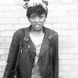
This is a close-up which was our number one idea, this we because we felt that the close ups would be most effective and it is a common convention that horror posters hold. In this close-up we can see the person’s emotions and the detail.

This was our second idea which is a long-shot. We felt that this idea was risky but could be a success. We understood that if we went with this idea we wouldn’t get the opportunity to show in detail the victims emotions. However, this gives us the chance to focus on the background. In the editing process we can add a range of effects to the background to create a very horror like effect.

Here is a similar close up, however the person is tilted here. This is a convention displayed in the saw III poster that we felt was successful as it creates a sense of disfiguration.

This is a high-angle. This was also an idea we considered as high angle shots always make the person look scared, shy and inferior. If our poster features the victim this would be a perfect match as the victim would look intimidated.
This is a medium shot which was a definete idea, we felt that this shot would allow us to show the background and setting and display costume at the same time.


0 comments:
Post a Comment